#Rebrand#Design System#Mobile
Nuwa: turning a pastel rebrand into an accessible, bilingual product system
Product Designer · 2022
The marketing team handed over a refreshed brand. My job was to turn it into something the product could actually be built from: a color system that passed contrast, a type scale that worked in two scripts, and five sub-brands a user could tell apart at a glance.
Context
Nuwa is the rebrand and redesign of Sihaty, a health platform running in Kuwait and Saudi Arabia, built by The Taken Seat ventures. Twelve weeks, three objectives:
- Modernize the brand identity of the product.
- Improve the current experience in accessibility, usability and aesthetics.
- Introduce the new sub-brands and features into the app.
The identity arrived as brand material, not as product material. That gap is the whole case study. Everything below starts from the same question: what does this brand have to become before a screen can be built out of it?
The design
Sub-brands users can tell apart
The rebrand introduced a range of Nuwa sub-brands, each covering a different service: nuwoman, nucare, numan, nusleep, nuskin. The experience had to feel verticalized, so that a user moving between services could see which one they were in without reading a label. Color was the obvious carrier, and the brand's answer was a pastel palette.
Pastels do not pass contrast on a light background, and they leave nothing underneath to build component states from. Rather than reject the palette, I extended it downward: deeper shades of each sub-brand color, with the darkest treated as that vertical's primary. The brand color stays recognizable where it belongs, in illustration and marketing surfaces; the deep shade does the work in the UI, where text sits on it and buttons need a pressed state. One set of rules that solved the contrast problem, kept our methodical approach to component states intact, and let each service carry its own color through the whole experience.
Two scripts, one weight scale
Brand had defined two typefaces: Montserrat for the English version, Almarai for the Arabic one. Building dynamic text styles across both broke immediately. Almarai has no Medium and no Semibold, so half the English scale had no Arabic counterpart. Bold in one script would have had to answer to Extra Bold in the other, and the hierarchy would have drifted apart every time a screen switched language.
Rather than argue the point in the abstract, I built the evidence. I designed a table in Figma putting the two typefaces side by side, weight for weight, with a live sample in both scripts and the missing weights marked "Not found". Next to it, the alternative I had found: Inter and Noto Kufi Arabic, matching all the way up. The gap was obvious in a glance, and the stakeholders signed off on the swap.
From styles to a system
With the fonts settled, I generated the styles in Figma so that what came out of this phase was not a document describing a system but the system itself: colors and text styles anyone on the team could apply, contribute to, and adjust at the root when something radical came down from brand.
Flows before screens
The product manager and I redefined the user flows for each feature in FigJam before any screen was drawn. Mapping a feature end to end was how we found the cases the old app had quietly left out, and it meant the screens I drew later had somewhere to sit rather than being invented one at a time.
From there I built the high-fidelity screens in Figma, working from the flows and from screenshots of the old application.
Screens
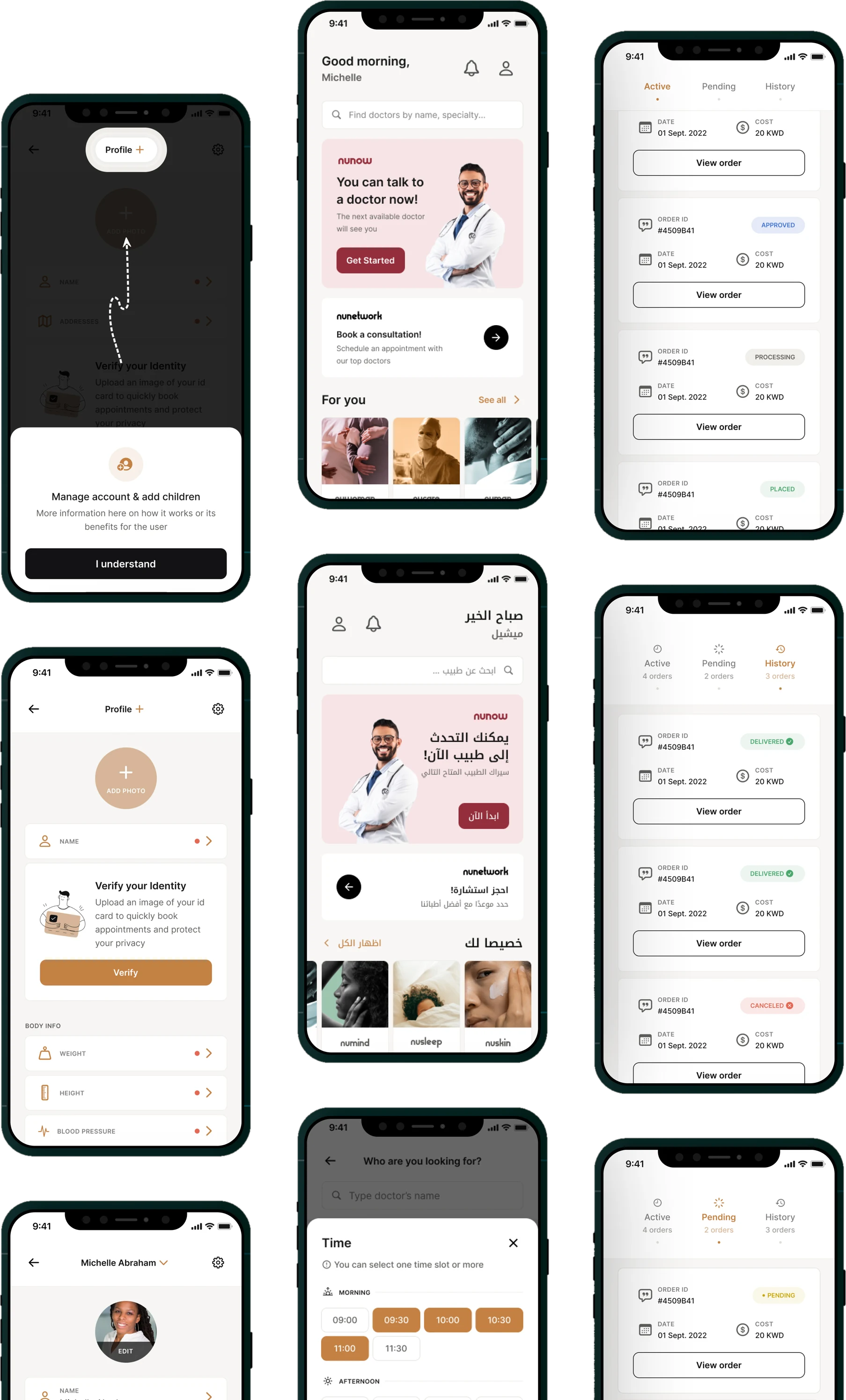
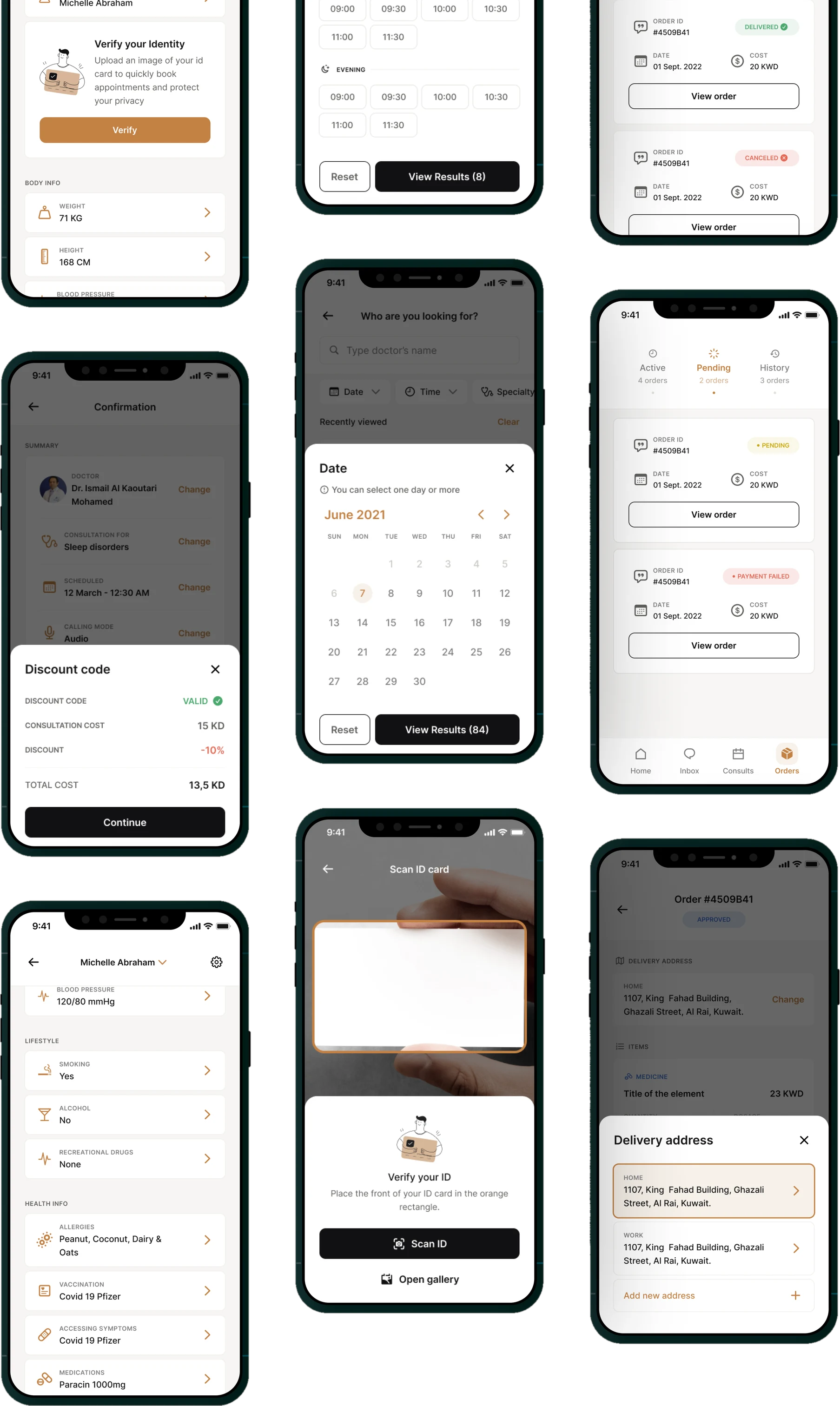
Outcome
Every finished section went through the same loop: review with the design team first, then with the stakeholders. Once a screen was accepted it moved into a separate file called Handoff, where developers could inspect it, comment on it and export its elements.
Keeping handoff in its own file was the part that mattered. The working file could stay unfinished and full of half-explored options without anyone building from a screen that had not been signed off.
Retrospective
- Constraints are not the opposite of creativity. The product already existed and its structure was not going to change much, which I first read as a limit on how much I could invent. It was not. Contrast, weights, verticals: each one needed an original answer. I just was not starting from a blank page.
- The loop was the work. I was fortunate to sit in a design team that gave feedback constantly, and to work with a product manager who treated the flows as ours rather than his. Most of what is above came out of that back and forth, not out of a solo pass.
- Brand handoff is not a finished handoff. As a UX designer you want the branding material to arrive complete and ready to use. In practice, defining what is actually ready for production is part of our job, and closing the gap between branding and UI takes both sides in the room.